KAIRA
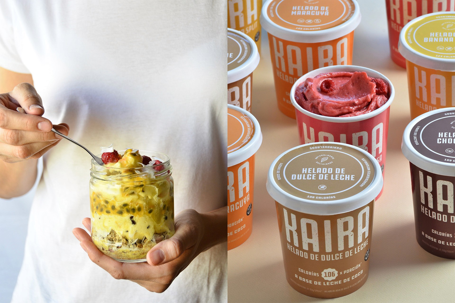
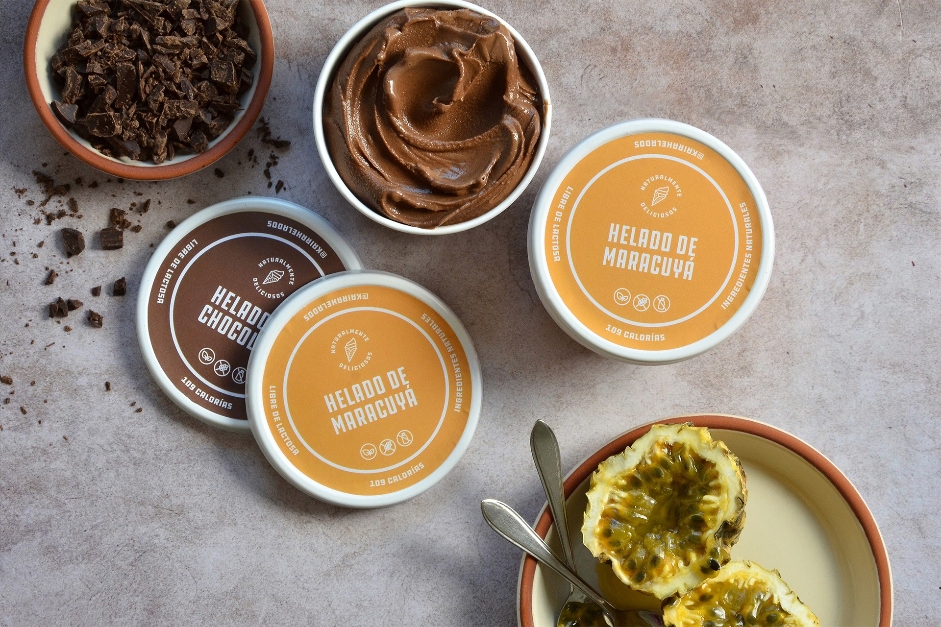
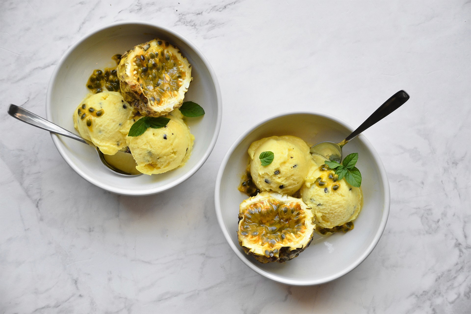
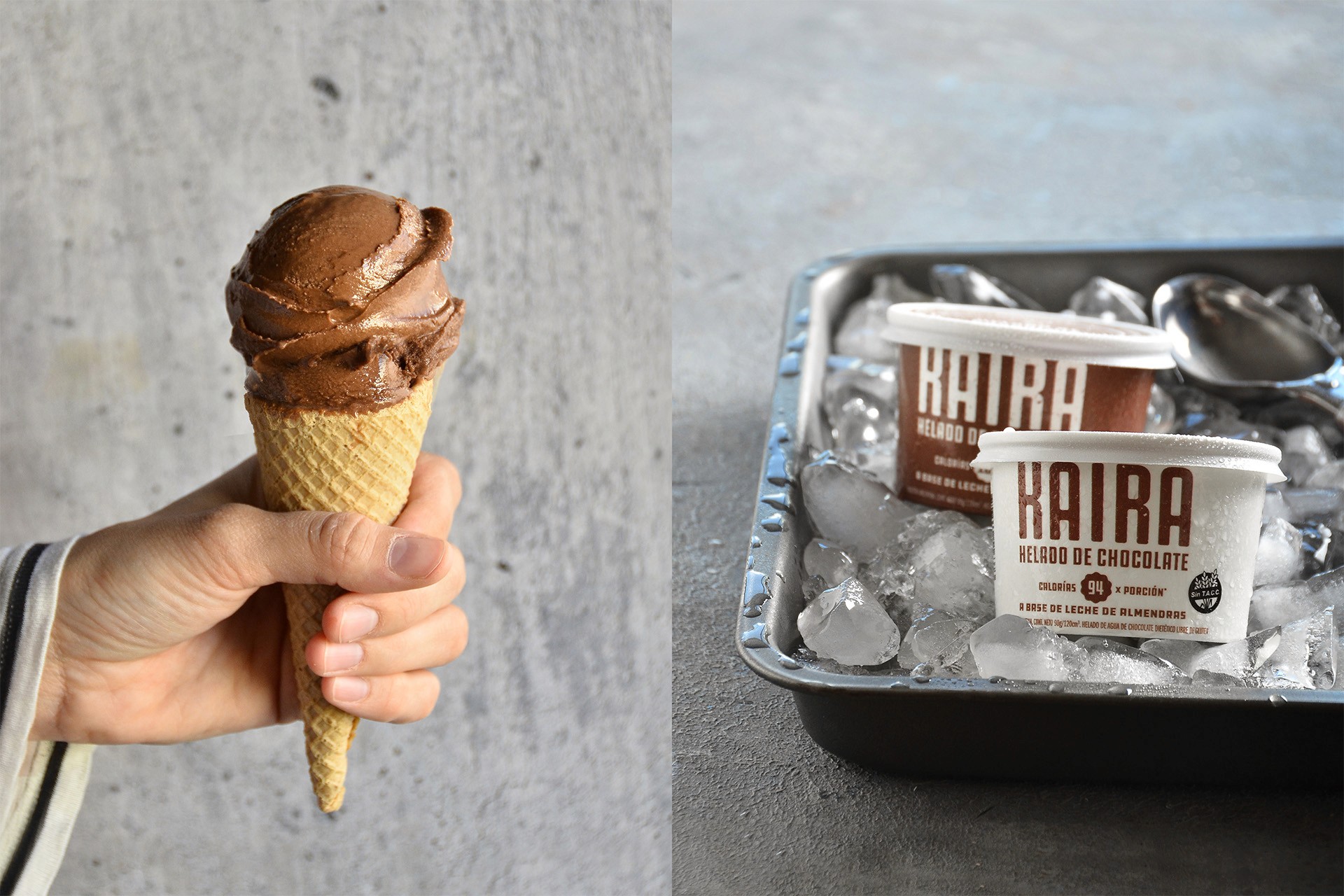
Born from a family with deep roots in artisanal ice cream, KAIRA takes a bold step forward with the launch of a new line of healthy frozen treats. Our challenge was to translate that shift into design — finding a visual language that’s clear, expressive, and stands out on the shelf without saying too much. Each flavor is represented by a strong color palette and a simple brand architecture that clearly separates the two lines: Classic and No Added Sugar. The result is a refreshed identity that honors tradition while speaking to a new kind of consumer. Photography: Mariela Díaz / Food Styling: Tatiana Seding
Client
Kaira
DELIVERABLES
Packaging Branding Art Direction


Ready to talk?
